編輯:關於Android編程
Android runs on a variety of devices that offer different screen sizes and densities. For applications, the Android system provides a consistent development environment across devices and handles most of the work to adjust each application’s user interface to the screen on which it is displayed. At the same time, the system provides APIs that allow you to control your application’s UI for specific screen sizes and densities, in order to optimize your UI design for different screen configurations. For example, you might want a UI for tablets that’s different from the UI for handsets.
Android系統運行在不同屏幕尺寸和屏幕密度的設備上.對於Android應用程序來說,Android系統在不同設備上提供了統一的開發環境,大部分工作是在調整應用程序需要顯示的界面上的用戶UI.與此同時,Android系統提供了API允許你單獨控制在特定屏幕和分辨率設備下的UI顯示.例如,在你的應用程序裡,你可以為平板電腦和手機提供不同的UI顯示.
Although the system performs scaling and resizing to make your application work on different screens, you should make the effort to optimize your application for different screen sizes and densities. In doing so, you maximize the user experience for all devices and your users believe that your application was actually designed for their devices—rather than simply stretched to fit the screen on their devices.
盡管Android系統可以在不同的屏幕上縮放、調整應用的UI,但是應用開發人員還是應該盡量的優化UI顯示,並適配UI到不同的屏幕尺寸和分辨率的屏幕上.這樣做時,你才能讓用戶相信你的應用就是針對他們而設計的,而不是簡單的拉伸應用UI界面來適配用戶的手機屏幕.
By following the practices described in this document, you can create an application that displays properly and provides an optimized user experience on all supported screen configurations, using a single .apk file.
按照本文的適配方法,通過一個apk文件,可以創建一個能夠正確適配各種屏幕的應用程序並且能夠提升用戶的使用體驗.
This section provides an overview of Android’s support for multiple screens, including: an introduction to the terms and concepts used in this document and in the API, a summary of the screen configurations that the system supports, and an overview of the API and underlying screen-compatibility features.
本節為Android多屏幕適配概述.包括:介紹本文中API用到的術語和概念,總結系統支持的屏幕配置,API概覽和介紹屏幕兼容特性.
Screen size
Actual physical size, measured as the screen’s diagonal.屏幕尺寸
屏幕實際的物理尺寸,是按照屏幕對角線計量的.
為了簡單起見,Android將所有屏幕劃分為四種廣義的尺寸:小、標准、大和超大.
Screen density
The quantity of pixels within a physical area of the screen; usually referred to as dpi (dots per inch). For example, a “low” density screen has fewer pixels within a given physical area, compared to a “normal” or “high” density screen.屏幕密度
屏幕每英寸的像素點數,通常也被簡稱為dpi(每英寸像素點數).例如,與標准和高密度的屏幕相比,低密度屏幕在每英寸中具有較少的像素點.
為了簡單起見,Android也將屏幕密度劃分為六種廣義密度:low,medium,high,extra-high,extra-extra-high和extra-extra-extra-high.
Orientation
The orientation of the screen from the user’s point of view. This is either landscape or portrait, meaning that the screen’s aspect ratio is either wide or tall, respectively. Be aware that not only do different devices operate in different orientations by default, but the orientation can change at runtime when the user rotates the device.屏幕方向
屏幕方向取決於用戶的角度.無論是橫向或者縱向,分別指的是屏幕的縱橫比例.需要注意的是,不僅是不同的設備有不同的運行方向,同一台設備用戶在使用過程中因為旋轉設備也可能會改變屏幕方向.
Resolution
The total number of physical pixels on a screen. When adding support for multiple screens, applications do not work directly with resolution; applications should be concerned only with screen size and density, as specified by the generalized size and density groups.屏幕分辨率
屏幕上的像素總數.當應用需要支持各種屏幕尺寸時,應用不需要關心屏幕的分辨率,而應該關心屏幕的尺寸和屏幕密度.
Density-independent pixel (dp)
A virtual pixel unit that you should use when defining UI layout, to express layout dimensions or position in a density-independent way.
The density-independent pixel is equivalent to one physical pixel on a 160 dpi screen, which is the baseline density assumed by the system for a “medium” density screen. At runtime, the system transparently handles any scaling of the dp units, as necessary, based on the actual density of the screen in use. The conversion of dp units to screen pixels is simple: px = dp * (dpi / 160). For example, on a 240 dpi screen, 1 dp equals 1.5 physical pixels. You should always use dp units when defining your application’s UI, to ensure proper display of your UI on screens with different densities.
密度無關像素
在定義UI布局時應該使用的密度無關像素單位.
1dp等於160dpi屏幕上的1像素,此屏幕為mdpi的屏幕.在應用程序運行時,系統會根據不同密度的屏幕處理dp的大小.dp轉px的公式為:px = dp * (dpi / 160).例如,在240dpi的屏幕上,1dp=1.5px.定義應用UI布局時,你應該總是使用dp單位,以確保在不同密度的屏幕上都能正確顯示你的UI布局.
Starting with Android 1.6 (API Level 4), Android provides support for multiple screen sizes and densities, reflecting the many different screen configurations that a device may have. You can use features of the Android system to optimize your application’s user interface for each screen configuration and ensure that your application not only renders properly, but provides the best user experience possible on each screen.
從Android1.6(API等級4)開始,Android已經提供了對不同屏幕尺寸和屏幕密度的支持,因為一個設備型號可能會有不同的屏幕配置.你可以利用Android系統的這些特性為每一個屏幕配置優化你的應用程序界面,確保你的應用程序不僅能正確的運行,而且還能盡可能在每一種屏幕上提供更好的用戶體驗.
To simplify the way that you design your user interfaces for multiple screens, Android divides the range of actual screen sizes and densities into:
A set of four generalized sizes: small, normal, large, and xlarge A set of six generalized densities:為了簡化多屏幕的UI適配,Android系統按照屏幕尺寸和屏幕密度劃分為:
四種廣義屏幕尺寸:小、標准、大,超大
六種廣義屏幕密度:ldpi(low) ~ 120dpi
mdpi(medium) ~ 160dpi
hdpi(high) ~ 240dpi
xhdpi(extra-high) ~ 320dpi
xxhdpi(extra-extra-high) ~ 480dpi
xxxhpi(extra-extra-extra-high) ~ 640dpi
The generalized sizes and densities are arranged around a baseline configuration that is a normal size and mdpi (medium) density. This baseline is based upon the screen configuration for the first Android-powered device, the T-Mobile G1, which has an HVGA screen (until Android 1.6, this was the only screen configuration that Android supported).
這種屏幕尺寸和密度的劃分是圍繞一種基准的配置進行劃分的.這種基准配置是指標准尺寸和mdpi的像素密度.這個基准也是基於Android第一款機型,T-Mobile G1,它具有HVGA的屏幕(直到Android1.6,這是Android唯一支持的屏幕配置).
Each generalized size and density spans a range of actual screen sizes and densities. For example, two devices that both report a screen size of normal might have actual screen sizes and aspect ratios that are slightly different when measured by hand. Similarly, two devices that report a screen density of hdpi might have real pixel densities that are slightly different. Android makes these differences abstract to applications, so you can provide UI designed for the generalized sizes and densities and let the system handle any final adjustments as necessary. Figure 1 illustrates how different sizes and densities are roughly categorized into the different size and density groups.
每個屏幕尺寸和屏幕密度的定義都包含了一個范圍.例如,用手測量時,兩個標准的屏幕尺寸的設備可能具有實際的稍微不同的屏幕尺寸和縱橫比.同樣的,兩個同是hdpi像素密度的手機在真正的屏幕像素密度上可能也會有細微的差別.Android系統讓這些差別對於應用程序來說無關,所以你可以為廣義的屏幕尺寸和密度提供UI設計,讓系統來處理最後的調整.圖1粗略的表明如何按照不同尺寸密度分類成不同的屏幕尺寸和屏幕密度.

As you design your UI for different screen sizes, you’ll discover that each design requires a minimum amount of space. So, each generalized screen size above has an associated minimum resolution that’s defined by the system. These minimum sizes are in “dp” units—the same units you should use when defining your layouts—which allows the system to avoid wZ喎?/kf/ware/vc/" target="_blank" class="keylink">vcnJ5aW5nIGFib3V0IGNoYW5nZXMgaW4gc2NyZWVuIGRlbnNpdHkuPC9wPg0KeGxhcmdlIHNjcmVlbnMgYXJlIGF0IGxlYXN0IDk2MGRwIHggNzIwZHAgbGFyZ2Ugc2NyZWVucyBhcmUgYXQgbGVhc3QgNjQwZHAgeCA0ODBkcCBub3JtYWwgc2NyZWVucyBhcmUgYXQgbGVhc3QgNDcwZHAgeCAzMjBkcCBzbWFsbCBzY3JlZW5zIGFyZSBhdCBsZWFzdCA0MjZkcCB4IDMyMGRwDQo8YmxvY2txdW90ZT4NCgk8cD61scTjzqqyu82stcTGwcS7yei8xlVJyrEsxOO9q7vht6LP1sO/0ru49snovMa2vNDo0qrSu7j21+7QobXExsHEu7/VvOQu0vK0yyzJz8PmzOG1vbXEw7/Su9bWxsHEu7PftOe2vNPQz7XNs7ao0uW1xM/gudjBqrXE1+7QobfWsebCyi7V4tCp1+7QobPftOfKudPDZHDOqrWlzrssus3E47ao0uVVSbXEtaXOu8/gzaws1eLR+cq5tcPPtc2zxNyx3MPisrvNrMbBxLvD3LbIz8K1xM/Uyr7Qp7n7srvSu9bCLjwvcD4NCgk8YmxvY2txdW90ZT4NCgkJPHA+s6y088bBxLvWwcnZOTYwZHAgeCA3MjBkcDxiciAvPg0KCQm088bBxLvWwcnZNjQwZHAgeCA0ODBkcDxiciAvPg0KCQmx6te8xsHEu9bBydk0NzBkcCB4IDMyMGRwPGJyIC8+DQoJCdChxsHEu9bBydk0MjZkcCB4IDMyMGRwPC9wPg0KCTwvYmxvY2txdW90ZT4NCjwvYmxvY2txdW90ZT4NCjxwPlRvIG9wdGltaXplIHlvdXIgYXBwbGljYXRpb24mcnNxdW87cyBVSSBmb3IgdGhlIGRpZmZlcmVudCBzY3JlZW4gc2l6ZXMgYW5kIGRlbnNpdGllcywgeW91IGNhbiBwcm92aWRlIGFsdGVybmF0aXZlIHJlc291cmNlcyBmb3IgYW55IG9mIHRoZSBnZW5lcmFsaXplZCBzaXplcyBhbmQgZGVuc2l0aWVzLiBUeXBpY2FsbHksIHlvdSBzaG91bGQgcHJvdmlkZSBhbHRlcm5hdGl2ZSBsYXlvdXRzIGZvciBzb21lIG9mIHRoZSBkaWZmZXJlbnQgc2NyZWVuIHNpemVzIGFuZCBhbHRlcm5hdGl2ZSBiaXRtYXAgaW1hZ2VzIGZvciBkaWZmZXJlbnQgc2NyZWVuIGRlbnNpdGllcy4gQXQgcnVudGltZSwgdGhlIHN5c3RlbSB1c2VzIHRoZSBhcHByb3ByaWF0ZSByZXNvdXJjZXMgZm9yIHlvdXIgYXBwbGljYXRpb24sIGJhc2VkIG9uIHRoZSBnZW5lcmFsaXplZCBzaXplIG9yIGRlbnNpdHkgb2YgdGhlIGN1cnJlbnQgZGV2aWNlIHNjcmVlbi48L3A+DQo8YmxvY2txdW90ZT4NCgk8cD7OqsHL1Nqyu82stcTGwcS7s9+057rNxsHEu8Pctsi1xMnosbjJz9PFu6/E47XE06bTw1VJLMTj06a4w86qsrvNrLXExsHEu7PftOe6zcPctsjM4bmpsrvNrLXEz9TKvtfK1LQu0ruw47+qt6LIy9SxtrzQ6NKq1NrNrNK7v+7TptPD1tDOqrK7zay1xMbBxLuz37Tnus3D3LbIzOG5qbK7zay1xLK8vtbOxLz+us3NvMas18rUtM7EvP4u1NpBbmRyb2lkz7XNs9TL0NDKsSxBbmRyb2lkz7XNs7vhuPm+3bWxx7DGwcS7tcSz37Tnus3D3LbI0aHU8brPysq1xLK8vtbOxLz+us3NvMas18rUtC48L3A+DQo8L2Jsb2NrcXVvdGU+DQo8cD5Zb3UgZG8gbm90IG5lZWQgdG8gcHJvdmlkZSBhbHRlcm5hdGl2ZSByZXNvdXJjZXMgZm9yIGV2ZXJ5IGNvbWJpbmF0aW9uIG9mIHNjcmVlbiBzaXplIGFuZCBkZW5zaXR5LiBUaGUgc3lzdGVtIHByb3ZpZGVzIHJvYnVzdCBjb21wYXRpYmlsaXR5IGZlYXR1cmVzIHRoYXQgY2FuIGhhbmRsZSBtb3N0IG9mIHRoZSB3b3JrIG9mIHJlbmRlcmluZyB5b3VyIGFwcGxpY2F0aW9uIG9uIGFueSBkZXZpY2Ugc2NyZWVuLCBwcm92aWRlZCB0aGF0IHlvdSZyc3F1bzt2ZSBpbXBsZW1lbnRlZCB5b3VyIFVJIHVzaW5nIHRlY2huaXF1ZXMgdGhhdCBhbGxvdyBpdCB0byBncmFjZWZ1bGx5IHJlc2l6ZSAoYXMgZGVzY3JpYmVkIGluIHRoZSBCZXN0IFByYWN0aWNlcywgYmVsb3cpLjwvcD4NCjxwPtTa06bTw7+qt6LW0CzDu7HY0qrOqsO/0rvW1sbBxLuz37Tnus3GwcS7w9y2yLXE1+m6z8zhuamyu82stcTXytS0LkFuZHJvaWTPtc2zu+HM4bmputzHv7TztcS85sjd0NQs1rvSqsTj1/HRrdXiwO/D6Mr2tcQ8YSBocmVmPQ=="https://developer.android.com/guide/practices/screens_support.html#screen-independence">最佳實踐,Android系統就能夠處理大多數的情況了.
Your application achieves “density independence” when it preserves the physical size (from the user’s point of view) of user interface elements when displayed on screens with different densities.
你的應用必須在不同密度的設備上,保持UI元素的物理尺寸比例不變(從用戶的角度來看),以實現密度無關的特性.
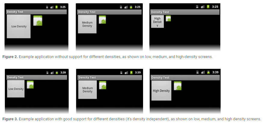
Maintaining density independence is important because, without it, a UI element (such as a button) appears physically larger on a low-density screen and smaller on a high-density screen. Such density-related size changes can cause problems in your application layout and usability. Figures 2 and 3 show the difference between an application when it does not provide density independence and when it does, respectively.
應用實現密度無關是非常重要的,如果應用無法實現密度無關,例如一個UI控件(像button這種)在低密度的屏幕上會顯得很大,而在高密度的屏幕上又會顯得很小.密度相關會導致你的應用在顯示上出現問題.圖2和圖3分別展示了不提供密度無關性和提供密度無關性時,應用程序的顯示差異.
The Android system helps your application achieve density independence in two ways:
The system scales dp units as appropriate for the current screen density The system scales drawable resources to the appropriate size, based on the current screen density, if necessaryAndroid系統通過兩個方式幫助你的應用實現密度無關的特性:
系統會在不同密度的屏幕上動態調整dp代表的像素值.
如有必要,系統會基於當前屏幕密度適配合適大小的圖片資源.
In figure 2, the text view and bitmap drawable have dimensions specified in pixels (px units), so the views are physically larger on a low-density screen and smaller on a high-density screen. This is because although the actual screen sizes may be the same, the high-density screen has more pixels per inch (the same amount of pixels fit in a smaller area). In figure 3, the layout dimensions are specified in density-independent pixels (dp units). Because the baseline for density-independent pixels is a medium-density screen, the device with a medium-density screen looks the same as it does in figure 2. For the low-density and high-density screens, however, the system scales the density-independent pixel values down and up, respectively, to fit the screen as appropriate.
在圖2中,TextView和Bitmap Drawable直接使用px為度量單位.View在低密度的屏幕上看起來很大,在高密度的屏幕上看起來又比較小.這是因為不同密度屏幕的每英寸像素數是不一致的.在圖3中,TextView和Bitmap Drawable使用dp這種密度無關的度量單位,因此在不同密度的屏幕上看起來的效果是一致的.
In most cases, you can ensure density independence in your application simply by specifying all layout dimension values in density-independent pixels (dp units) or with “wrap_content”, as appropriate. The system then scales bitmap drawables as appropriate in order to display at the appropriate size, based on the appropriate scaling factor for the current screen’s density.
在大多數情況下,使用dp為度量單位或者使用wrap_content這種度量屬性可以使你的應用具備屏幕密度無關特性.系統會基於當前屏幕密度使用合適的比例來適當的調整.
However, bitmap scaling can result in blurry or pixelated bitmaps, which you might notice in the above screenshots. To avoid these artifacts, you should provide alternative bitmap resources for different densities. For example, you should provide higher-resolution bitmaps for high-density screens and the system will use those instead of resizing the bitmap designed for medium-density screens. The following section describes more about how to supply alternative resources for different screen configurations.
然而,系統對圖片的調整可能導致圖片顯示的模糊等問題.為了避免這種問題,你應該為不同密度的屏幕提供不同的圖片資源.例如,你應該為hdpi的屏幕提供高分辨率的圖片資源,為標准屏幕提供標准分辨率的圖片資源,而不是讓系統去根據屏幕密度來進行圖片的調整.接下來的章節主要介紹如何為不同密度的屏幕提供不同的資源.
The foundation of Android’s support for multiple screens is its ability to manage the rendering of an application’s layout and bitmap drawables in an appropriate way for the current screen configuration. The system handles most of the work to render your application properly on each screen configuration by scaling layouts to fit the screen size/density and scaling bitmap drawables for the screen density, as appropriate. To more gracefully handle different screen configurations, however, you should also:
Explicitly declare in the manifest which screen sizes your application supports
By declaring which screen sizes your application supports, you can ensure that only devices with the screens you support can download your application. Declaring support for different screen sizes can also affect how the system draws your application on larger screens—specifically, whether your application runs in screen compatibility mode.
To declare the screen sizes your application supports, you should include the
Provide different layouts for different screen sizes
By default, Android resizes your application layout to fit the current device screen. In most cases, this works fine. In other cases, your UI might not look as good and might need adjustments for different screen sizes. For example, on a larger screen, you might want to adjust the position and size of some elements to take advantage of the additional screen space, or on a smaller screen, you might need to adjust sizes so that everything can fit on the screen.
The configuration qualifiers you can use to provide size-specific resources are small, normal, large, and xlarge. For example, layouts for an extra-large screen should go in layout-xlarge/.
Beginning with Android 3.2 (API level 13), the above size groups are deprecated and you should instead use the sw
Provide different bitmap drawables for different screen densities
By default, Android scales your bitmap drawables (.png, .jpg, and .gif files) and Nine-Patch drawables (.9.png files) so that they render at the appropriate physical size on each device. For example, if your application provides bitmap drawables only for the baseline, medium screen density (mdpi), then the system scales them up when on a high-density screen, and scales them down when on a low-density screen. This scaling can cause artifacts in the bitmaps. To ensure your bitmaps look their best, you should include alternative versions at different resolutions for different screen densities.
The configuration qualifiers (described in detail below) that you can use for density-specific resources are ldpi (low), mdpi (medium), hdpi (high), xhdpi extra-high), xxhdpi (extra-extra-high), and xxxhdpi (extra-extra-extra-high). For example, bitmaps for high-density screens should go in drawable-hdpi/.
Android能夠適配多種屏幕的基礎在於它能根據當前屏幕的參數、配置來決定需要渲染的布局和圖片資源.Android系統為了能在不同密度的屏幕上合理的顯示應用,花了大量的工作用來處理布局和圖片的調整.為了更好的適配不同的屏幕,應用開發人員應該注意以下幾點:
在你的AndroidManifest文件中聲明應用支持的屏幕尺寸.
通過這種聲明,你可以保證只有符合屏幕尺寸要求的設備才能下載安裝你的應用.聲明不同尺寸屏幕會影響到系統在屏幕上如何繪制你的App,特別是當你的應用是運行在屏幕兼容模式下.
在AndroidManifest.xml中,通過””標簽來聲明你要支持的屏幕尺寸. 為不同規格的屏幕提供不同的布局文件
默認情況下,Android系統會調整應用布局來適配當前的屏幕密度.大多數情況下,布局適配沒有太大問題.但是也有例外,不同屏幕尺寸情況下你的UI可能需要單獨調整.例如,在較大的屏幕上,可能需要調整某些元素的位置和尺寸來充分利用額外的屏幕空間,或者在較小的屏幕上,會調整尺寸使得一切都可以在屏幕上顯示.
可以使用Android系統提供的大小限定符,有small,normal,large和xlarge.例如,為超大屏幕適配的布局文件應該存放在layout-xlarge目錄下.
從Android3.2(API等級13)開始,上面的尺寸分組已經被棄用,你應該使用swdp限定符去定義布局資源需要的最小的可用寬度.例如,如果多窗口的平板布局至少需要600dp的屏幕寬度,因此你應該把平板的布局文件存放在layout-sw600dp目錄下. 為不同密度的屏幕提供不同的圖片資源
默認情況下,Android系統會自動調整你的圖片資源(.png, .jpg和.gif文件)和.9資源圖片(.9.png文件),以便讓資源在不同密度的屏幕上顯示適當的物理尺寸.例如,如果你的應用中只為mdpi的標准屏幕提供了一份圖片資源,那麼在hdpi的屏幕上,Android系統會拉伸你的資源,在ldpi的屏幕上,Android系統會壓縮你的資源.因此,為了確保你的圖片資源看起來正常,你需要為不同密度的屏幕提供不同的圖片資源.可以用來指定密度資源的限定符有ldpi,mdpi,hdpi,xhdpi,xxhdpi和xxxhdpi.例如,為hdpi屏幕准備的圖片資源應該存放在drawable-hdpi目錄下.
Note: The mipmap-xxxhdpi qualifier is necessary only to provide a launcher icon that can appear larger than usual on an xxhdpi device. You do not need to provide xxxhdpi assets for all your app’s images.
注意:mipmap-xxxhdpi目錄是為了在超過xxxhdpi的設備上存放桌面圖標的.你不需要為應用內所有的圖片都提供xxxhdpi的資源.
At runtime, the system ensures the best possible display on the current screen with the following procedure for any given resource:
The system uses the appropriate alternative resource
Based on the size and density of the current screen, the system uses any size- and density-specific resource provided in your application. For example, if the device has a high-density screen and the application requests a drawable resource, the system looks for a drawable resource directory that best matches the device configuration. Depending on the other alternative resources available, a resource directory with the hdpi qualifier (such as drawable-hdpi/) might be the best match, so the system uses the drawable resource from this directory.
If no matching resource is available, the system uses the default resource and scales it up or down as needed to match the current screen size and density
The “default” resources are those that are not tagged with a configuration qualifier. For example, the resources in drawable/ are the default drawable resources. The system assumes that default resources are designed for the baseline screen size and density, which is a normal screen size and a medium-density. As such, the system scales default density resources up for high-density screens and down for low-density screens, as appropriate.
However, when the system is looking for a density-specific resource and does not find it in the density-specific directory, it won’t always use the default resources. The system may instead use one of the other density-specific resources in order to provide better results when scaling. For example, when looking for a low-density resource and it is not available, the system prefers to scale-down the high-density version of the resource, because the system can easily scale a high-density resource down to low-density by a factor of 0.5, with fewer artifacts, compared to scaling a medium-density resource by a factor of 0.75.
在Android系統運行時,系統通過以下幾個步驟來保證屏幕上有最佳的顯示效果:
系統選擇合適的資源來顯示
基於當前屏幕的尺寸和密度,系統會選擇應用程序中合適的資源.例如,在hdpi的設備上,應用程序需要一個圖片資源,這時系統會尋找最適合在hdpi屏幕上顯示的圖片資源,一般會去drawable-hdpi目錄下查找,因為這個目錄下的資源是最匹配hdpi的屏幕的. 如果沒有匹配的資源可用,系統會使用默認資源且會拉伸或者壓縮資源來適配當前屏幕的密度和尺寸
默認資源是指那些存放在沒有被限定符標記的目錄下的資源.例如,在drawable目錄下就是默認的圖片資源.Android系統假定默認資源是為基准屏幕尺寸和密度設計的,即標准屏幕尺寸和mdpi的屏幕密度.同樣的,系統會為hdpi的屏幕拉伸默認資源,會為ldpi的屏幕壓縮默認資源.
然而,當系統在尋找一個指定密度的資源且在匹配限定符目錄下沒找到它時,系統不一定總是使用默認資源.為了獲取更好的壓縮或拉伸效果,系統會使用一個其他指定密度的資源.例如,當系統尋找ldpi的資源且沒找到時,系統會優先尋找hdpi的資源然後通過壓縮來使用.因為系統通過換算,可以輕易知道只需要將hdpi的資源簡單的乘以0.5系數來壓縮即可得到ldpi的資源了.這比使用默認資源乘以0.75系數花費的工作要小很多.
Android supports several configuration qualifiers that allow you to control how the system selects your alternative resources based on the characteristics of the current device screen. A configuration qualifier is a string that you can append to a resource directory in your Android project and specifies the configuration for which the resources inside are designed.
Android系統支持多種限定符,讓你可以控制系統如何基於當前的屏幕尺寸和密度選擇合適的資源.一個限定符是一個字符串,你可以把它附加到你的Android工程的資源目錄上以指定這是特定尺寸和密度的資源目錄.
To use a configuration qualifier:
Create a new directory in your project’s res/ directory and name it using the format:使用限定符的方法:
在res目錄下創建資源目錄,命名方式為:resources_name-qualifier
resources_name是資源目錄名,例如drawable或者layout qualifier是限定符名稱,例如hdpi或者xlarge. 將相應的資源保存在上面創建的特定目錄中.注意,例如drawable-hdpi的目錄只能放置hdpi的資源圖片,不要放錯了.
For example, xlarge is a configuration qualifier for extra-large screens. When you append this string to a resource directory name (such as layout-xlarge), it indicates to the system that these resources are to be used on devices that have an extra-large screen.
例如,xlarge限定符是為超大屏幕做的適配標識.當你把xlarge加到相應的目錄後面(例如layout-xlarge),這就意味著當處於超大屏幕時需要會從有xlarge標識的目錄中尋找資源文件.
Table 1. Configuration qualifiers that allow you to provide special resources for different screen configurations.
表格1. 為應用提供的屏幕尺寸限定符和屏幕密度限定符.
For example, the following application resource directories provide different layout designs for different screen sizes and different drawables. Use the mipmap/ folders for launcher icons.
以下是應用程序的資源目錄列表.其中mipmap目錄是用來存放應用圖標的.
However, if your application supports all screen sizes supported by Android (as small as 426dp x 320dp), then you don’t need to declare this attribute, because the smallest width your application requires is the smallest possible on any device.
android:compatibleWidthLimitDp
This attribute allows you to enable screen compatibility mode as a user-optional feature by specifying the maximum “smallest width” that your application supports. If the smallest side of a device’s available screen is greater than your value here, users can still install your application, but are offered to run it in screen compatibility mode. By default, screen compatibility mode is disabled and your layout is resized to fit the screen as usual, but a button is available in the system bar that allows users to toggle screen compatibility mode on and off.
android:largestWidthLimitDp
This attribute allows you to force-enable screen compatibility mode by specifying the maximum “smallest width” that your application supports. If the smallest side of a device’s available screen is greater than your value here, the application runs in screen compatibility mode with no way for the user to disable it.
Android3.2隨著新的限定符也引進了新的manifest元素屬性:
指定應用所需要的最小寬度.
SmallestWidth必須是能被應用程序UI利用的屏幕控件的最小尺寸(單位是dp),也是屏幕高或寬中的最小尺寸.因此,為了讓設備與應用程序兼容,設備的smallestWidth必須大於等於這個值.
例如,如果你的應用只適配最小寬度為600dp的屏幕,那需要在AndroidManifest中添加如下聲明:然而,如果應用程序支持所有Android支持的屏幕尺寸,那麼沒有必要申明這個屬性了.
android:compatibleWidthLimitDp
這個屬性用來兼容通過指定應用程序支持的最小寬度.如果可用設備的最小值大於這個值,用戶仍然可以安裝應用程序,但是不能再屏幕的兼容模式上運行.默認情況下,屏幕的兼容模式是關閉的.android:largestWidthLimitDp
這個屬性通過指定你的應用程序支持的最大“最小寬度”強制開啟屏幕的兼容模式,如果設備的可用屏幕最小邊大於這個值,應用程序會運行在屏幕兼容模式上,且用戶沒有辦法去禁用它.
The objective of supporting multiple screens is to create an application that can function properly and look good on any of the generalized screen configurations supported by Android. The previous sections of this document provide information about how Android adapts your application to screen configurations and how you can customize the look of your application on different screen configurations. This section provides some additional tips and an overview of techniques that help ensure that your application scales properly for different screen configurations.
支持多個屏幕尺寸的目標是開發一個在任何屏幕尺寸上都能夠很好顯示的Android應用程序.本文前面的章節介紹了Android系統是如何讓應用程序適配不同屏幕的以及如何在不同尺寸的屏幕上自定義自己的UI布局.這一章節提供了更多的適配多種屏幕的開發技巧.
Here is a quick checklist about how you can ensure that your application displays properly on different screens:
Use wrap_content, match_parent, or dp units when specifying dimensions in an XML layout file Do not use hard coded pixel values in your application code Do not use AbsoluteLayout (it’s deprecated) Supply alternative bitmap drawables for different screen densitiesThe following sections provide more details.
這裡給出適配方案的簡介列表:
在layout布局中聲明寬或高時盡量使用wrap_content, match_parent或者dp等密度無關的度量單位. 不要在應用程序代碼中為布局指定px硬編碼. 不要使用絕對布局,AbsoluteLayout布局已經被廢棄了. 為不同密度的屏幕提供不同的圖片資源.接下來,是每一條建議的詳細描述.
When defining the android:layout_width and android:layout_height for views in an XML layout file, using “wrap_content”, “match_parent” or dp units guarantees that the view is given an appropriate size on the current device screen.
在layout布局文件中定義寬和高時,使用wrap_content, match_parent, dp等密度無關單位可以在不同的屏幕尺寸上都獲得比較好的顯示效果.
For instance, a view with a layout_width=”100dp” measures 100 pixels wide on medium-density screen and the system scales it up to 150 pixels wide on high-density screen, so that the view occupies approximately the same physical space on the screen.
例如,一個View的寬度聲明為100dp,則意味著在mdpi的屏幕上,這個View占據的寬度為100px,而在hdpi的屏幕上,這個View占據的寬度為150px.因此雖然兩個屏幕的密度不同,但是View控件寬度所占據的屏幕比例幾乎是相同的.
Similarly, you should prefer the sp (scale-independent pixel) to define text sizes. The sp scale factor depends on a user setting and the system scales the size the same as it does for dp.
同樣的,在修飾文字大小時建議使用sp為單位,而不是使用px.sp針對字體大小的效果和dp針對view大小的效果類似.
For performance reasons and to keep the code simpler, the Android system uses pixels as the standard unit for expressing dimension or coordinate values. That means that the dimensions of a view are always expressed in the code using pixels, but always based on the current screen density. For instance, if myView.getWidth() returns 10, the view is 10 pixels wide on the current screen, but on a device with a higher density screen, the value returned might be 15. If you use pixel values in your application code to work with bitmaps that are not pre-scaled for the current screen density, you might need to scale the pixel values that you use in your code to match the un-scaled bitmap source.
為了性能考慮和兼顧代碼簡潔,Android系統使用px作為尺寸和坐標值的標准單位.這意味著,在代碼中去測量一個View的大小總是基於當前屏幕的密度轉換成px來表示.例如,通過myView.getWidth()返回的值為10,說明在當前屏幕密度下myView占據的寬度為10px,但是當換一個更高密度的屏幕時,myView.getWidth()返回的值可能就是15px了.如果你基於當前屏幕密度下,使用px來測試bitmap的大小,你計算時需要考慮到當前的屏幕密度值.
Unlike the other layouts widgets, AbsoluteLayout enforces the use of fixed positions to lay out its child views, which can easily lead to user interfaces that do not work well on different displays. Because of this, AbsoluteLayout was deprecated in Android 1.5 (API Level 3).
不像其他布局控件,AbsoluteLayout強制你在xml文件裡固定每個子View的位置,這很容易導致你的布局文件不能適配其他密度的屏幕.因此,AbsoluteLayout在Android1.5上就被廢棄了.
You should instead use RelativeLayout, which uses relative positioning to lay out its child views. For instance, you can specify that a button widget should appear “to the right of” a text widget.
Android系統推薦你使用RelativeLayout,它可以讓你的子控件的布局可以根據情況動態調整.例如,你可以讓一個Button布局在一個TextView的右邊.
Although the system scales your layout and drawable resources based on the current screen configuration, you may want to make adjustments to the UI on different screen sizes and provide bitmap drawables that are optimized for different densities. This essentially reiterates the information from earlier in this document.
盡管Android系統會基於當前屏幕尺寸和密度來調整你的布局和圖片資源,但是你可能希望在不同的屏幕尺寸和密度上顯示不同的資源圖片或者布局.前文已經詳細介紹過這種實現方法了,就是通過限定符來標識目錄.
If you need to control exactly how your application will look on various screen configurations, adjust your layouts and bitmap drawables in configuration-specific resource directories. For example, consider an icon that you want to display on medium and high-density screens. Simply create your icon at two different sizes (for instance 100x100 for medium-density and 150x150 for high-density) and put the two variations in the appropriate directories, using the proper qualifiers:
res/drawable-mdpi/icon.png //for medium-density screens
res/drawable-hdpi/icon.png //for high-density screens
如果你需要能精確的控制你的應用在不同屏幕尺寸和密度下的顯示,你就需要用到限定符修飾的目錄.例如,你想要在mdpi和hdpi兩種屏幕密度下顯示不同的icon圖片,你可以先創建兩個不同尺寸的icon圖片,然後把它們分別放到被特定限制符修飾的目錄下(100x100大小的圖片放到mdpi目錄,150x150大小的圖片放到hdpi目錄下).
This section describes more about how Android performs scaling for bitmap drawables on different screen densities and how you can further control how bitmaps are drawn on different densities. The information in this section shouldn’t be important to most applications, unless you have encountered problems in your application when running on different screen densities or your application manipulates graphics.
這個章節會更加詳細的介紹Android系統是如何調整圖片資源的,同時介紹了更多方法讓你可以更好的操控圖片在不同密度屏幕上的顯示.
To better understand how you can support multiple densities when manipulating graphics at runtime, you should understand that the system helps ensure the proper scale for bitmaps in the following ways:
Pre-scaling of resources (such as bitmap drawables)
Based on the density of the current screen, the system uses any size- or density-specific resources from your application and displays them without scaling. If resources are not available in the correct density, the system loads the default resources and scales them up or down as needed to match the current screen’s density. The system assumes that default resources (those from a directory without configuration qualifiers) are designed for the baseline screen density (mdpi), unless they are loaded from a density-specific resource directory. Pre-scaling is, thus, what the system does when resizing a bitmap to the appropriate size for the current screen density.
If you request the dimensions of a pre-scaled resource, the system returns values representing the dimensions after scaling. For example, a bitmap designed at 50x50 pixels for an mdpi screen is scaled to 75x75 pixels on an hdpi screen (if there is no alternative resource for hdpi) and the system reports the size as such.
There are some situations in which you might not want Android to pre-scale a resource. The easiest way to avoid pre-scaling is to put the resource in a resource directory with the nodpi configuration qualifier. For example:
res/drawable-nodpi/icon.png
When the system uses the icon.png bitmap from this folder, it does not scale it based on the current device density.
Auto-scaling of pixel dimensions and coordinates
An application can disable pre-scaling by setting android:anyDensity to “false” in the manifest or programmatically for a Bitmap by setting inScaled to “false”. In this case, the system auto-scales any absolute pixel coordinates and pixel dimension values at draw time. It does this to ensure that pixel-defined screen elements are still displayed at approximately the same physical size as they would be at the baseline screen density (mdpi). The system handles this scaling transparently to the application and reports the scaled pixel dimensions to the application, rather than physical pixel dimensions.
For instance, suppose a device has a WVGA high-density screen, which is 480x800 and about the same size as a traditional HVGA screen, but it’s running an application that has disabled pre-scaling. In this case, the system will “lie” to the application when it queries for screen dimensions, and report 320x533 (the approximate mdpi translation for the screen density). Then, when the application does drawing operations, such as invalidating the rectangle from (10,10) to (100, 100), the system transforms the coordinates by scaling them the appropriate amount, and actually invalidate the region (15,15) to (150, 150). This discrepancy may cause unexpected behavior if your application directly manipulates the scaled bitmap, but this is considered a reasonable trade-off to keep the performance of applications as good as possible. If you encounter this situation, read the following section about Converting dp units to pixel units.
Usually, you should not disable pre-scaling. The best way to support multiple screens is to follow the basic techniques described above in How to Support Multiple Screens.
為了更好的理解Android系統是如何在運行時對圖片資源進行調整,你需要理解Android系統是如何來選中合適的圖片資源的,以下是Android系統的篩選步驟:
預先調整資源
基於當前屏幕的密度,系統會選擇是否有匹配限定符修飾的資源.如果沒有匹配限定符修飾的資源,系統會使用默認的圖片資源並依據當前屏幕的密度進行適當調整.系統假定默認資源目錄(即沒有被限定符修飾的目錄)中的資源都是為標准屏幕(即mdpi)准備的.
如果開發人員需要知道被預先調整資源的大小,系統會返回已經按照當前屏幕密度調整後的圖片大小.例如,針對mdpi屏幕提供的50x50像素的圖片在hdpi屏幕上返回的大小是75x75像素.
想讓Android不去調整你的資源有很多種方法,其中最簡單的就是將資源放到被nodpi限定符修飾的目錄中.例如:
res/drawable-nodpi/icon.png
當系統使用drawable-nodpi目錄下的icon.png圖片時,無論當前屏幕密度是多少,icon都不會被調整.自動調節尺寸和坐標值
應用可以通過在AndroidManifest.xml中設置android:anyDensity為false或者在代碼中設置Bitmap的inScaled為false來禁止預先的調整資源.在這種情況下,系統會在繪制時自動調整絕對像素的坐標值和尺寸.這樣做的目的是,為了確保已經定義像素的元素在其他密度的屏幕上仍然能夠以接近它們在基准屏幕密度上的比例顯示出來.系統會把調整後的像素值告知應用程序,調整過程對應用程序來說是透明的.
例如,假定一個設備有WVGA高密度屏幕,即480x800,這與傳統的HVGA屏幕的尺寸大致相同,但是該設備已經禁止了預先調整應用資源的功能.在這種情況下,在應用程序查詢當前屏幕密度時,系統會欺騙應用程序,假定當前的屏幕密度為320x533(欺騙的屏幕密度接近mdpi).然後,當應用程序開始繪制操作時,例如使(10,10)到(100, 100)的區域對應用無效,應用會將這部分坐標值進行相應的調整,最終無效的區域實際是(15, 15)到(150, 150).如果你的應用程序直接使用調整後的Bitmap對象,這個誤差會導致不可預期的行為,但是這被認為是合理的折衷的盡可能保持應用性能的方法.
通常情況下,你不應該禁止系統的預先調整功能.最好的適配多種屏幕密度的方式就是參考本文之前介紹的方法.
If your application manipulates bitmaps or directly interacts with pixels on the screen in some other way, you might need to take additional steps to support different screen densities. For example, if you respond to touch gestures by counting the number of pixels that a finger crosses, you need to use the appropriate density-independent pixel values, instead of actual pixels.
如果你的應用程序在屏幕上以其他某種方式操作Bitmap對象或者直接與像素交互,你可能需要采取額外的步驟來支持不同密度的屏幕.例如,你可以計算手指劃過的像素值來響應觸摸,你需要使用密度無關像素值,而不是使用實際的像素值.
If your application creates an in-memory bitmap (a Bitmap object), the system assumes that the bitmap is designed for the baseline medium-density screen, by default, and auto-scales the bitmap at draw time. The system applies “auto-scaling” to a Bitmap when the bitmap has unspecified density properties. If you don’t properly account for the current device’s screen density and specify the bitmap’s density properties, the auto-scaling can result in scaling artifacts the same as when you don’t provide alternative resources.
如果你的應用在內存中創建一個Bitmap對象,系統會認為這個Bitmap對象是為標准密度屏幕設計的,默認情況下,在繪制時會自動調整Bitmap對象.當Bitmap對象沒有明確定義自己的density屬性是,系統會采用自動調整的方式.如果你沒有考慮到當前屏幕密度也沒有聲明Bitmap的density屬性,系統會和沒有提供可選擇資源時的方式一樣去處理Bitmap對象.
To control whether a Bitmap created at runtime is scaled or not, you can specify the density of the bitmap with setDensity(), passing a density constant from DisplayMetrics, such as DENSITY_HIGH or DENSITY_LOW.
為了控制在運行時是否對Bitmap對象進行調整,你可以通過setDensity()函數對Bitmap對象的density屬性進行指定.傳遞的參數應該是DisplayMetrics對象的常量,例如DENSITY_HIGH或者DENSITY_LOW.
If you’re creating a Bitmap using BitmapFactory, such as from a file or a stream, you can use BitmapFactory.Options to define properties of the bitmap as it already exists, which determine if or how the system will scale it. For example, you can use the inDensity field to define the density for which the bitmap is designed and the inScaled field to specify whether the bitmap should scale to match the current device’s screen density.
如果你使用BitmapFactory類從文件或者流中創建Bitmap對象,你可以使用BitmapFactory.Options來定義bitmap的屬性值.例如,你可以使用inDensity字段來定義Bitmap是為哪種屏幕密度設計的,也可以使用inScaled字段來定義Bitmap在當前屏幕密度下是否需要系統進行調整.
If you set the inScaled field to false, then you disable any pre-scaling that the system may apply to the bitmap and the system will then auto-scale it at draw time. Using auto-scaling instead of pre-scaling can be more CPU expensive, but uses less memory.
如果你設置inScaled字段值為false,相當於禁用了系統的Bitmap預先調整功能,系統會在運行時繪制Bitmap的時候對其自動進行調整.使用自動調整方案,會增加CPU的負擔,但同時也會減少內存的使用.
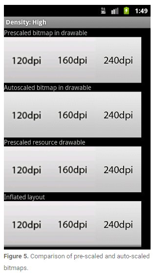
Figure 5 demonstrates the results of the pre-scale and auto-scale mechanisms when loading low (120), medium (160) and high (240) density bitmaps on a high-density screen. The differences are subtle, because all of the bitmaps are being scaled to match the current screen density, however the scaled bitmaps have slightly different appearances depending on whether they are pre-scaled or auto-scaled at draw time.
圖5展示了在hdpi屏幕密度上加載低(120),中(160)和高(240)密度圖片預先調整和自動調整的效果對比.區別是很微小的,因為Bitmap對象都會調整成適應當前屏幕密度的樣式,然而在外觀上還是會有些許不同,這取決於是采用預先調整還是繪制時自動調整.
In some cases, you will need to express dimensions in dp and then convert them to pixels. Imagine an application in which a scroll or fling gesture is recognized after the user’s finger has moved by at least 16 pixels. On a baseline screen, a user’s must move by 16 pixels / 160 dpi, which equals 1/10th of an inch (or 2.5 mm) before the gesture is recognized. On a device with a high-density display (240dpi), the user’s must move by 16 pixels / 240 dpi, which equals 1/15th of an inch (or 1.7 mm). The distance is much shorter and the application thus appears more sensitive to the user.
在某些情況下,你可能在xml文件中使用dp來標注大小同時需要在代碼中將其轉成px.在應用程序中,只有當用戶手指劃過16px時才會被系統認為是一個scroll或者fling的手勢.在標准密度的屏幕上,用戶必須移動 16px / 160dpi,相當於 1 / 10 英寸才能被檢測到.在高密度的屏幕上(240dpi),用戶必須移動16px/240dpi,相當於1/15英寸.這個距離在更高分辨率的屏幕上會顯得更加敏感.
To fix this issue, the gesture threshold must be expressed in code in dp and then converted to actual pixels. For example:
為了解決這個問題,gesture threshold必須用dp來表示距離,並且在不同密度的屏幕上將其轉換成像素.例如:
// The gesture threshold expressed in dp
private static final float GESTURE_THRESHOLD_DP = 16.0f;

// Get the screen’s density scale
final float scale = getResources().getDisplayMetrics().density;
// Convert the dps to pixels, based on density scale
mGestureThreshold = (int) (GESTURE_THRESHOLD_DP * scale + 0.5f);

// Use mGestureThreshold as a distance in pixels...
Before publishing your application, you should thoroughly test it in all of the supported screen sizes and densities. The Android SDK includes emulator skins you can use, which replicate the sizes and densities of common screen configurations on which your application is likely to run. You can also modify the default size, density, and resolution of the emulator skins to replicate the characteristics of any specific screen. Using the emulator skins and additional custom configurations allows you to test any possible screen configuration, so you don’t have to buy various devices just to test your application’s screen support.
在你發布應用之前,你應該在所有你想支持的密度和尺寸的屏幕上測試你的應用程序.Android SDK中提供了模擬器來幫助你實現在不同屏幕尺寸和屏幕密度上測試你的應用.你可以修改模擬器的屏幕尺寸,屏幕密度和屏幕分辨率.使用模擬器可以幫你模擬任何你想模擬的屏幕,這樣你就不需要去購買真實設備來測試你的應用程序了.
To set up an environment for testing your application’s screen support, you should create a series of AVDs (Android Virtual Devices), using emulator skins and screen configurations that emulate the screen sizes and densities you want your application to support. To do so, you can use the AVD Manager to create the AVDs and launch them with a graphical interface.
為了給你的應用搭建測試環境,你應該使用你想支持的屏幕尺寸和屏幕密度創建一系列Android虛擬設備.要做到這一點,可以使用AVD管理器去創建AVD,然後在圖形化界面啟動AVD.
To launch the Android SDK Manager, execute the SDK Manager.exe from your Android SDK directory (on Windows only) or execute android from the
為了啟動Android SDK Manager,在window環境下可以在你Android SDK目錄下執行SDK Manager.exe文件,在其他環境下(Linux或者Mac),可以再SDK目錄的tools目錄下執行android這個應用程序.圖6展示了AVD Manager的示例.
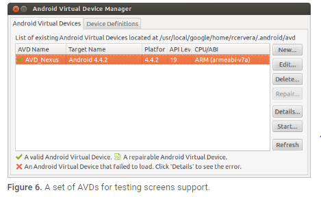
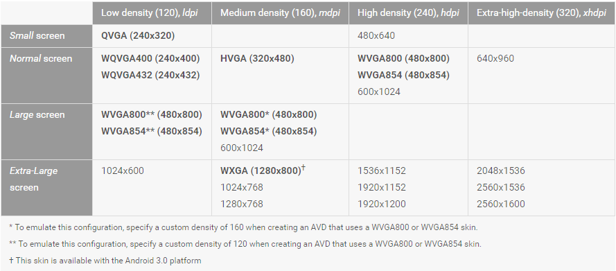
Table 3 shows the various emulator skins that are available in the Android SDK, which you can use to emulate some of the most common screen configurations.
表三展示了Android SDK中你可以使用的通用模擬器屬性值.
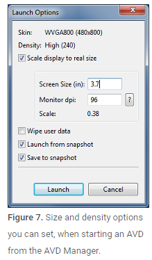
We also recommend that you test your application in an emulator that is set up to run at a physical size that closely matches an actual device. This makes it a lot easier to compare the results at various sizes and densities. To do so you need to know the approximate density, in dpi, of your computer monitor (for instance, a 30” Dell monitor has a density of about 96 dpi). When you launch an AVD from the AVD Manager, you can specify the screen size for the emulator and your monitor dpi in the Launch Options, as shown in figure 7.
我們同樣建議在屏幕尺寸大約接近的模擬器上測試應用程序.這樣做可以使得比較結果更加明顯.為了做到這一點,你需要知道電腦顯示器的近似密度.當你從AVD Manager啟動AVD時,你可以指定模擬器的屏幕尺寸和顯示器的dpi如表7所示.
If you would like to test your application on a screen that uses a resolution or density not supported by the built-in skins, you can create an AVD that uses a custom resolution or density. When creating the AVD from the AVD Manager, specify the Resolution, instead of selecting a Built-in Skin.
如果你想在一個沒有在內置屬性支持的屏幕上測試應用程序,你可以創建一個使用自定義分辨率或者屏幕密度的AVD.在創建AVD時,應該手動的指定屏幕密度和分辨率.
If you are launching your AVD from the command line, you can specify the scale for the emulator with the -scale option. For example:
如果你從命令行啟動AVD,你可以通過-scale參數來指定屏幕分辨率.例如:
emulator -avd -scale 96dpi
To refine the size of the emulator, you can instead pass the -scale option a number between 0.1 and 3 that represents the desired scaling factor.
為了改變模擬器的尺寸,你可以通過指定-scale參數的值為0.1~3來改變比例因子.
 Android智能指針分析(sp、wp)
在Android native編寫代碼時,會經常接觸到sp、wp,sp並不是smart pointer的意思,而是strong point;wp就是weak point
 android項目 之 記事本(11) ----- 添加數據庫
通過之前的10節,已實現了記事本的大部分功能,有添加拍照,添加照片,添加錄音,添加繪圖,添加手寫,另外細心的可以發現,底部菜單還有一個更多的選項,這個以後再
 Android官方MVP架構示例項目解析[轉載]
項目MVP實現方式這節我們就具體來看官方示例到底是如何實現mvp的。這裡我們先看下總體的輪廓,關於項目中業務代碼我們僅列出了任務詳情頁(taskDetail)的相關類,其
 Ionic2創建App啟動頁左右滑動歡迎界面
摘要:每個有逼格的App在第一次啟動時都有一個歡迎界面,通常是幾個單頁面或者帶動畫的單頁面滑動到最後一頁有個啟動的按鈕,本文將使用Ionic2來創建,So easy!效果